

In short
The latest MCP RSI Intelligence update brings probability points to six timeframes: 5m, 15m, 1h, 4h, daily and weekly. A small count next to the meter now shows how many of the five points are lit, from 0 of 5 to 5 of 5. A fix makes the divergences on your chart match the design the ParadiseTeam tested, and the RSI is now one violet line. What the points mean has not changed: they grade the RSI’s own reading, never price.
What changed in this update?
Four things changed, and the meaning of the probability points did not. The points now cover six timeframes and come with a small count. A divergence fix makes the chart match the tested design. And the pane got a cleaner look.
- Six timeframes: points on the 5m, 15m, 1h, 4h, daily and weekly charts.
- A count by the meter: 0 of 5 to 5 of 5, readable at a glance.
- Divergence fix: the divergences on your chart now match the design.
- One violet line: slimmer, with five equal points on every chart.
What is different here
Most indicator updates add something and stop there. This one also holds every timeframe to the same standard before it shows a single point. A strength score is only useful if it never claims more than it can show.

Which timeframes show probability points now?
Six: 5m, 15m, 1h, 4h, daily and weekly. A strength grade is only useful on the chart you actually trade. These six run from quick intraday moves to slow swings, so most trading styles now get a graded reading on the chart they already use.
Every one of them is held to the same standard before it shows a single point. The points are calibrated with AI on years of market behaviour, then locked before they reach your chart. Where the evidence for a reading is thin, the panel says No edge instead of guessing.
What will you notice on your charts?
Some readings may now carry more points than before, and some fewer. Neither is a fault. It is the same standard, applied on all six timeframes. If a reading carries fewer points than you expect, the evidence behind it is thinner than it looks.
On any other timeframe, the panel now reads the momentum in words, without points, and the count stays blank. The second line, the divergences, the dots and the alerts work there as before.
That is the trade we chose. One point that stands up to testing is worth more than three that do not. A strength score earns trust slowly and loses it quickly.
What does the new count next to the meter show?
A small count now follows the five points, from 0 of 5 to 5 of 5, so the strength reads at a glance. At 0 of 5, the reading was graded and is too weak to lean on, which is when the word says No edge.
A blank count means there is nothing to grade. The chart is still warming up, or the timeframe is not one of the six. Hover the meter there and it names the six charts that carry points.
What was fixed in the divergences?
Some divergence lines on the chart did not match the design the ParadiseTeam tested. The update corrects that, so the divergences drawn on your chart are the ones that were tested. Nothing about how you read them changes: the same four names, the same green and red.
A few labels in older history may change once after the update. That is the correction redrawing them, not the indicator repainting. New readings still settle on closed candles.
Why is the RSI line now one violet colour?
The RSI line used to change colour at the 50 line: violet above it, orange below it. It is now one violet line, slightly slimmer, on both sides. The side is already shown by the 50 line and by the panel, so the colour no longer needs to repeat it.
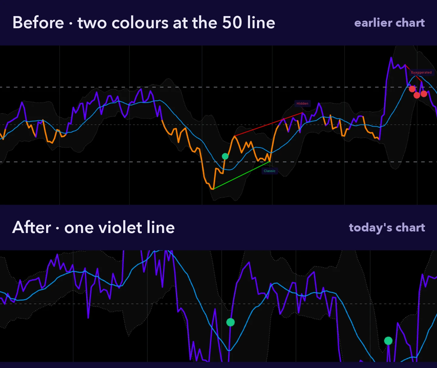
The probability points keep their green and red, because those colours carry one meaning across every MCP indicator. The update also fixes a display quirk: on narrow charts the fifth point used to stretch wider than the others. All five now keep the same size on any chart width.
Do you need to do anything?
Reload your chart first. If the old look remains, remove MCP RSI Intelligence and add it again from Invite-only scripts in the TradingView Indicators menu. If you changed colours in the Style tab, Defaults, then Reset settings, puts the house look back.
Alerts need one extra step. A TradingView alert keeps the script version it was created with, as TradingView’s alerts FAQ explains. Delete your existing MCP RSI Intelligence alerts and create them again. The alert names have not changed.
What stays the same?
- The 0 to 5 scale, the five words and No edge.
- The four divergence names: Classic, Exaggerated, Weak and Hidden.
- Readings settle on closed candles and never repaint.
- No settings to change, on any chart.
And the meaning of the points. They grade how strong the RSI’s own reading is, never where price goes next. Our walkthrough of how to use MCP RSI Intelligence covers every element on the pane, from the dots to the alerts.
MCP RSI Intelligence is part of AI Indicators by MCP and is included with PRO Paradiser. New to the RSI itself? The free class on how to read RSI explains the 50 line, divergences and probability points without any tool.
Frequently asked questions
Why do some readings show a different number of points?
Because all six timeframes are now held to the same standard before they show points. A reading can carry more or fewer points than before, but never more than it has earned. What the points mean has not changed: they still grade how strong the RSI’s own reading is.
Why is the count next to the meter blank?
Because there is nothing to count yet. The count stays blank while the chart warms up and on any timeframe other than 5m, 15m, 1h, 4h, daily and weekly. Switch to one of those six and it shows 0 of 5 to 5 of 5.
Did the meaning of probability points change?
No. They still grade how strong the RSI’s own reading is, on the same 0 to 5 scale, from No edge up to five points. They never forecast price direction, targets or timing. The update changes where they appear and adds a count beside them, not what they mean.
Do my old alerts use the update?
Not automatically. A TradingView alert keeps the script version it was created with. Delete your existing MCP RSI Intelligence alerts and create them again, set to Once per bar close, so they run on the updated version. The alert names have not changed.
Why did some divergence labels change in older history?
The update corrects how some divergences were drawn, so the chart now matches the design the ParadiseTeam tested. A few labels in older history can change once as the corrected version redraws them. That is a one-time correction, not repainting: new readings still settle on closed candles.
Crypto trading involves substantial risk and is not suitable for everyone. Nothing here is financial advice; it is education only. Never risk more than you can afford to lose.










Join the discussion
No comments yet. Members, share how you are reading this.