

In short
MCP Positioning Intelligence is a TradingView indicator from AI Indicators by MCP that reads the crowd. It shows whether positions are being opened or closed, which side the crowd leans to, and whether that lean is unusual for this market. A machine-learning model built by the ParadiseTeam grades every crowd reading on every chart. Use it as context for a trade you already have a reason for, never as an entry on its own.
What is MCP Positioning Intelligence?
MCP Positioning Intelligence is an indicator in AI Indicators by MCP, built by the ParadiseTeam and included with PRO Paradiser. It reads three things at once: open interest across the major exchanges, the share of accounts positioned long, and price. Any one of them alone can fool you. Read together, they tell a story.
What is different here
Most positioning charts show a long/short ratio against an even split. This one compares the crowd with its own usual balance for each market, because on some coins a long-heavy crowd is perfectly ordinary. Unusual always means unusual for this coin.
It answers one of the eight questions on the AI Indicators page: is the crowd one-sided, and is it arriving late? New to the idea itself? The free class on reading open interest and the long/short ratio together explains it without any tool.

How do you add MCP Positioning Intelligence to your chart?
MCP Positioning Intelligence is an invite-only script on TradingView, included with PRO Paradiser. A free TradingView account is enough. Once the ParadiseTeam has added the script to your account, it appears under invite-only scripts in the Indicators menu. It works on any crypto chart, spot charts included.
- Join PRO Paradiser, the membership that includes the indicator.
- Leave your TradingView username on your members’ page.
- The ParadiseTeam adds the script, usually within a day.
- On TradingView, open Indicators, then Invite-only scripts.
- Add MCP Positioning Intelligence to any chart.
There is one input, the perpetual ticker override, and it stays empty on most charts. Fill it only when a coin’s futures ticker differs from its spot ticker, for example 1000PEPEUSDT.P on a PEPE chart. Everything else is fixed, so every member sees the same reading on the same chart.
What does the crowd line show?
The thick line is the long-account share: of the accounts holding a position in this market, how many are long. It counts accounts, not money. One account can hold the size of a hundred, so the line shows how the crowd leans, never how much each side has invested. Its colour follows the crowd.
- Calm grey: the crowd sits at its usual balance for this market.
- Purple: the crowd leans more long than usual, deepening near a guide.
- Orange: the crowd leans more short than usual, deepening near a guide.
The dashed line is the usual balance, where the crowd normally sits in this market. The shaded band around it is the usual range. Its dotted upper edge marks where the crowd becomes unusually long-heavy, and its lower edge where it becomes unusually short-heavy. Purple never means price will rise, and orange never means price will fall.
Why is a 45% long crowd sometimes “more longs than usual”?
Because the tool reads each market against its own usual balance, not against an even split. On a coin whose crowd usually sits lower, 45% long is already a long lean. The colour and the words follow this market’s normal, which is why the same number can mean different things on different coins.
Our live BTC long/short ratio page shows the crowd’s split on Bitcoin right now.
What do the columns under the line show?
Under the usual range sits a slim band of columns, one per candle. They answer the question every positioning chart leaves open: is this the same people, or new people? A column pointing up means positions were added. A column pointing down means positions were closed. No column means open interest held flat.
- Purple: long accounts were moving.
- Orange: short accounts were moving.
- Grey: both sides moved together.
A taller column means a stronger move, and the newest column is shown brightest. So a tall purple column pointing up reads as new longs entering, and an orange column pointing down reads as shorts leaving. Small labels at the right edge name the guides, the usual balance and the columns. For the wider picture, our live Bitcoin and crypto open interest page tracks it as it changes.
A hollow column means price moved clearly while open interest fell. The move ran on positions closing, a covering rally or a liquidation drop, not on new money. That is the divergence to watch between price and open interest.
Rising open interest backs a move in either direction. So a solid column pointing up under a falling price is new money behind the drop, not a divergence.
Line three names it in words, such as “Short covering” or “Long liquidation”. The points do not change on a hollow column: it describes the move, not the crowd’s lean.

How do you read the status panel?
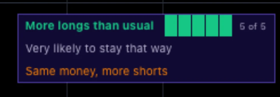
The panel in the top right reads the last closed candle in three lines. Line one names the crowd’s side and carries the probability points. Line two says what to expect from a lean like this. Line three names who is moving. Hover any line and the full reading opens, with what would change it.
Line one: the crowd’s side and the points
With probability points, line one reads “More longs than usual” in green or “More shorts than usual” in red. The points light in the same colour, with a small count from “0 of 5” to “5 of 5”. When the crowd leans but earns no points, the same words appear in white. “No edge” means there is no lean to grade on that candle.
“More longs than usual” is not a call on price. It means more of this market’s accounts are long than its usual balance. You may also see “Warming up” while the tool collects history, and “No data” where nothing resolves.
Line two: what to expect from the lean
With points, line two turns the grade into words. Two points read “Likely to stay that way”, and three read “Usually stays that way”. Four or five read “Very likely to stay that way”. A lean without points still gets words. “May stay that way” marks an ordinary lean. “Often swings back soon” marks a slight or new one.
When the lean cannot be graded on that candle, line two gives the long share against the usual range instead. For example: “62% long, high but usual”. The other endings are “unusually high”, “usual range”, “low but usual”, “unusually low”, and “history thin” while the usual balance is still being learned.
Line three: who is moving
Line three names the move in the columns’ colours. When price moved too, it names a situation, such as “Short covering”, “Long liquidation”, “Longs chasing” or “Longs catching the knife”. Otherwise it reads “New longs entering”, “Longs leaving”, “Same money, more longs”, “Both sides adding” or “Positions steady”, among others.
For a short time after an event, line three turns gold and names it. The six names are “Late longs”, “Late shorts”, “Unusually long-heavy”, “Unusually short-heavy”, “Redistribution to longs” and “Redistribution to shorts”. The hover names every recent event, including “Open interest up broadly”, which never turns a panel line gold.
What do the probability points mean, and what do they not mean?
The points grade the crowd’s lean, never price. A machine-learning model built by the ParadiseTeam grades every crowd reading on every chart. A reading never shows more points than the ParadiseTeam’s measured research allows. A lit meter shows two to five points, and more points mean a more settled crowd.
Zero points does not mean nothing is there. When the crowd leans, line one still names its side in white. Line two then says whether the lean may stay that way or often swings back soon. Points show on every timeframe, because the crowd is one crowd on every chart.
On most charts the points follow the crowd’s slower rhythm, so they change a few times a day at most, not with every candle. A crowd’s lean changes slowly, so points can stay lit for long stretches. A lit meter describes a settled crowd. It is not a reason to trade.
Is a long-heavy crowd bearish for price?
Not on its own. That is the answer the hover itself gives: “Is that bullish or bearish for price? Not on its own.” A crowd can keep leaning long while price keeps rising, and keep leaning short while price falls. A long-heavy crowd is not a sell signal, and a short-heavy crowd is not a buy signal.
What the tool adds is context for a level you already care about. Read it with price and the level in play: is price being accepted beyond the level, or rejected at it? Did open interest keep building, or did it drain? Did the crowd’s lean change before price did?
What do the dots on the crowd line mean?
Small dots on the share line mark two moments. One is the crowd moving beyond a guide; the other is the start of a run of late longs or late shorts. Hover any dot and it explains itself. A dot on a candle whose reading carries points takes the crowd’s colour, green for long and red for short.
- Unusually long-heavy or unusually short-heavy: the crowd has just moved beyond a guide.
- Late longs: new long accounts keep arriving into a rising price while the crowd is already long-heavy.
- Late shorts: the mirror, on a falling price with a short-heavy crowd.
Every other dot is one neutral colour. Late longs at resistance and late shorts at support are places to look closer, never trades. Redistribution and open interest rising broadly have no dot; the hover names them for a short time instead.
Which alerts can you set?
Eight alerts are built in, and their names match the events on the panel and in the hover. Most traders need only one: “Any positioning event” covers late longs, late shorts, both redistributions and both unusual crowd readings. Set it to Once per bar close, then check the chart when it fires.
- “Late longs” and “Late shorts”.
- “Unusually long-heavy” and “Unusually short-heavy”.
- “Redistribution to longs” and “Redistribution to shorts”.
- “Open interest up broadly” and “Any positioning event”.
How do you use it in a trade?
Use it as context for a trade you already have a reason for. It is another layer of confirmation for your own method, not a signal service. Use the timeframe you already trade, and give the crowd’s story the most weight near a level that already matters on your chart.
- Mark your level first: support, resistance, or the range edge in play.
- Check where the crowd sits against its usual balance and the guides.
- Read line three: who is moving, and is new money arriving or leaving?
- Weigh the points as how settled the crowd is. Give “Often swings back soon” little weight.
- Let your own risk plan decide the size, never the points.
What can it not do?
It never tells you who is trading, how many accounts sit behind a reading, or how big any one of them is. It never tells you where price goes next. A rising long share does not prove new long accounts arrived, because fewer short accounts raise it too. That is exactly why it reads the share together with open interest.
Some charts show the reading in words, without points: unusual chart types such as Heikin Ashi, and some markets. On a coin with open interest but no account split, the panel says “No account ratio here”. Where nothing resolves, it says “No positioning data here”. It says so rather than guessing.
AI Indicators by MCP
MCP Positioning Intelligence is live for PRO Paradisers.
Frequently asked questions
Does MCP Positioning Intelligence tell you when to buy or sell?
No. It shows whether positions are being opened or closed, which side the crowd leans to, and whether that lean is unusual for this market. A long-heavy crowd is not a sell signal, and a short-heavy crowd is not a buy signal. Use it as context next to a level and a plan.
Which timeframe should you use it on?
The one you already trade. Probability points show on every timeframe, because the crowd is one crowd on every chart. On most charts the points follow the crowd’s slower rhythm, so they change a few times a day at most. The line, the columns and the dots work everywhere.
Why does the panel name a side but show no points?
The crowd leans, but the lean did not earn points on that candle. Line two then says what to expect. “May stay that way” marks an ordinary lean, and “Often swings back soon” marks a slight or new one. Give the second kind little weight in your plan.
Does MCP Positioning Intelligence repaint?
The share line follows the candle that is still forming, so it moves until the candle closes. The panel, its points and the hover read the last closed candle. Dots and alerts appear only on closed candles and do not repaint, so a dot you saw stays where it was.
What does a column pointing up under the line mean?
Positions were added on that candle: open interest rose across the major exchanges. Purple means long accounts were moving, orange means short accounts, and grey means both sides together. A taller column means a stronger move. A column pointing down means positions were closed instead.
Crypto trading involves substantial risk and is not suitable for everyone. Nothing here is financial advice; it is education only. Never risk more than you can afford to lose.







Join the discussion
No comments yet. Members, share how you are reading this.