

In short
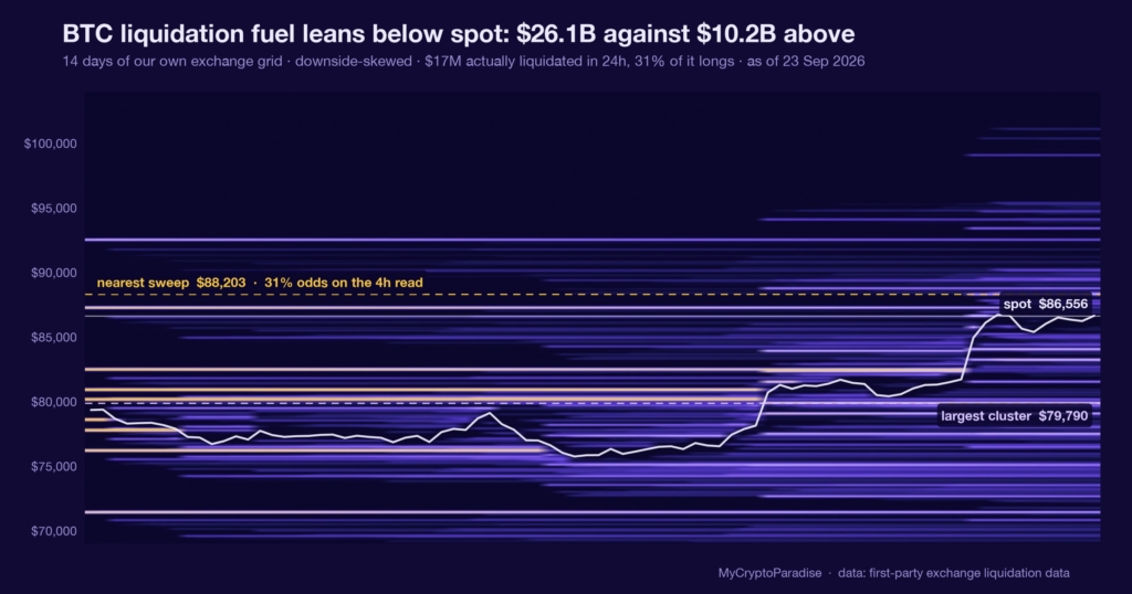
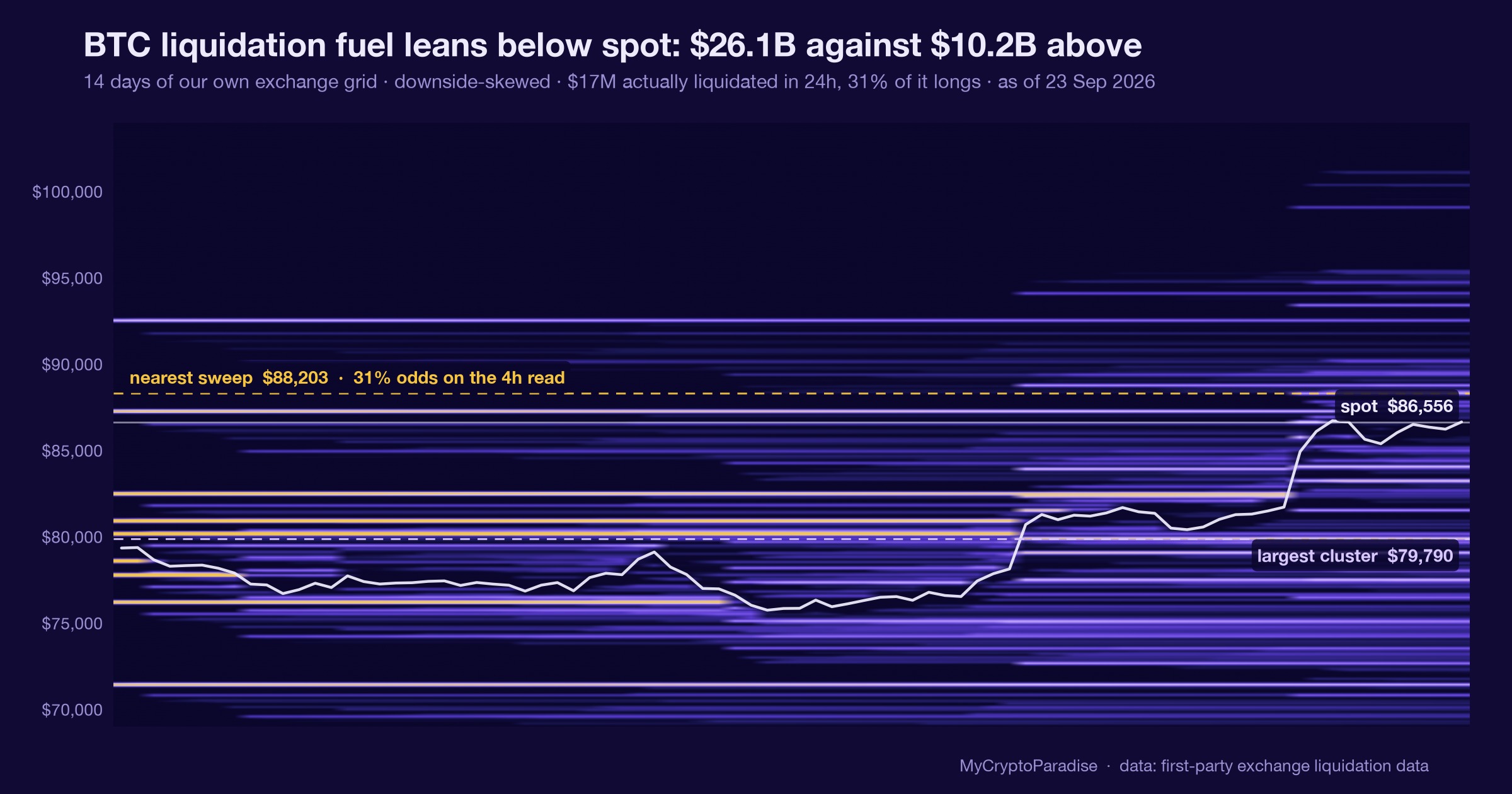
A liquidation fuel map counts the leveraged positions whose forced exits would become market orders at each price. Our own MCP Insights liquidation reading on 23 September 2026 shows BTC fuel stacked below: $26.1B of it against $10.2B above, a ratio of 2.5 to 1 and an imbalance score of -44. We read that as defensive, with the heavier pocket sitting under price, and we explicitly do not call it a downside forecast. This reading carries estimated status: it is our model estimate, not a gate-passed historical frequency, so we quote no base rate here and grade it forward honestly, misses included. The asymmetry is an observation about where stops rest right now, not a claim about where price goes next. This piece shows you how to read a liquidation fuel map yourself, and the one level that would flip it.
Key facts
- BTC spot at the reading
- $86,556
- Estimated BTC liquidation fuel above spot
- $10.24B
- Estimated BTC liquidation fuel below spot
- $26.06B
- Fuel balance
- downside-skewed, -44 points toward the heavier side
- What would prove this read wrong
- The imbalance narrowing back toward balance from -44, or a daily grind up through the thin upside fuel that leaves the heavier pocket below untested, either of which shows the resting fuel drained without the cascade it implied.
- Reading taken
- 23 September 2026
- Source
- Our MCP Insights tools, from first-party exchange data
Forced exits become market orders
A liquidation fuel map is not a forecast tool. It is an inventory of leveraged positions and the prices at which an exchange would close them automatically, because the trader can no longer fund the margin behind them.
When price reaches one of those prices, the exit is not a choice. A long being liquidated is sold at market whether the holder wants out or not, and that forced selling can reach the next cluster below, which liquidates the next set of longs.
That is why the map matters more than any single position. A cluster is a measure of how much fuel a move would find, not a promise that the move arrives.
The 23 September map leans downhill
Our MCP Insights liquidation reading, timestamped 23 September 2026 (UTC), puts $26.1B of BTC fuel below spot against $10.2B above it, a total of $36.3B mapped. That is 71.9 percent of the fuel sitting under price, and 28.1 percent above.
The ratio is 2.5 to 1 in favour of the downside, a net of $15.9B, and our imbalance score reads -44 on a scale where zero is balanced. The heavier pocket is below, and it is more than twice the size of the one above.
This reading carries estimated status and has not passed its calibration gate, so we quote it as our own model estimate, not as a calibrated probability. We re-verified the split against the live liquidation series rather than the source note.
A fuel map with an honest confidence flag is worth more than one that hides it. The number is real; its error bar is that it is modelled.
What is different here
The ParadiseTeam does not read a liquidation map as a direction to trade. We treat it as an inventory of forced flow, flag when the number is a model estimate rather than a calibrated rate, and size the heavier side as risk while naming the level that would prove the lean wrong.
A lopsided map is a lean, not a level
The obvious misreading is that more fuel below means price falls. It does not. The map says a move down would be amplified if it starts, because it would find more positions to force out; it says nothing about whether the move begins.
Read the other way, the same map is a magnet argument, not a direction. Clusters attract price because forced flow is predictable flow, which is exactly why the heavier side is where risk concentrates rather than where certainty lives.
This is one input. It sits alongside funding, open interest and spot absorption, and on its own a fuel map is a probability weight on a bias, never the bias itself.
A gauge that tells you where the fuel sits, and admits it cannot tell you the spark, is more useful than one that always finds a direction.
Forced flow is predictable, so it gets hunted
A large resting pocket is not neutral information. Every participant who can see a cluster below price knows that pushing into it releases forced sellers, and that the released flow carries price further in the same direction at no extra cost.
That incentive is why lopsided maps often resolve toward the heavier side, and also why they sometimes do not: once enough participants expect the sweep, some position ahead of it and the move front-runs itself into exhaustion.
The map tells you where the fuel is, not who lights it or when. Reading the incentive is how you hold the lean without mistaking it for a schedule.
Without base rates, we grade forward
We cannot tell you how often a map this lopsided resolved lower, because base rates for liquidation regimes are not wired into our data yet. Inventing a frequency here would be decoration, so we publish none.
What we can do is register the read and grade it against what actually happens. If the downside pocket gets swept, we log it; if price grinds up through thinner fuel and leaves the heavy side untested, that is a miss and it goes in the ledger.
A read with no error bar is not evidence. A read that names the level which would prove it wrong is at least accountable, and accountable is the entire point of this stream.
Reading a liquidation fuel map yourself, step by step
- Open the liquidation heatmap and find current spot, then note the total fuel mapped above price and below it.
- Divide the larger side by the smaller to get the ratio; 2.5 to 1 means one side holds two and a half times the fuel.
- Check the imbalance score for direction and size; a negative number means the heavier pocket sits below current price.
- Confirm the reading is gate-passed, not estimated; a modelled figure is usable but must be quoted as an estimate.
- Mark the price that would flip the lean, then treat the heavier pocket as a risk weight, never as an entry.
The step people skip is the estimate flag. A map that reads decisively but has not passed its calibration gate is a hypothesis with a chart, not a measured rate.
Every number above is checkable against the live data. Start with the crypto liquidation heatmap, then cross-read the MCP Insights hub and the Crypto Fear and Greed Index.
Act and invalidate
| Scenario | What confirms it | What kills it |
|---|---|---|
| Downside pocket is swept | Cascade of long liquidations below spot | Price holds above the cluster |
| Fuel drains without a move | Ratio narrows toward balance | Imbalance stays past -40 |
| Lean is wrong | Grind up through thin upside fuel | Heavy side left untested |
Posture: Defensive while the heavier pocket sits below, sized as one line of risk rather than a position. The lean is a weight on a bias, not a trade, and it converts only if price enters the lower fuel.
Frequently asked questions
What does a 2.5 to 1 liquidation imbalance mean?
It means the resting liquidation fuel below current price is two and a half times the size of the fuel above it. On 23 September that was $26.1B against $10.2B. It measures where forced selling would concentrate, not where price is headed.
Is more fuel below a bearish sign?
Not on its own. A heavier pocket below means a decline would be amplified if it starts, because it would force more longs to sell. It says nothing about whether that decline begins, which is why we treat it as risk weight, not direction.
Why is this reading called an estimate?
Because the liquidation series carries an estimated flag and has not passed its calibration gate. We quote it as our own model estimate rather than a historical frequency, so you know its confidence is modelled and not yet independently verified against outcomes.
What level would invalidate this downside lean?
The lean weakens if the imbalance narrows back toward balance from its current -44, or if price grinds higher through the thinner upside fuel and leaves the heavy pocket below untested. Either outcome shows the resting fuel drained without the cascade it implied.
How should a trader use a fuel map?
As one input among several, never as an entry. It tells you which direction carries more forced-flow risk, so you can size exposure and place invalidation with that asymmetry in mind. It sits alongside funding, open interest and spot absorption, not above them.
Crypto trading involves substantial risk and is not suitable for everyone. Nothing here is financial advice; it is education only. Never risk more than you can afford to lose.
The private Extras feed, where the liquidation fuel map, its imbalance score and the forced-flow read update intraday with invalidation levels attached, is part of PRO Paradiser, the intelligence layer behind the ParadiseFamilyVIP strategies.










Join the discussion 4
Yeah teh leverage 🤦♂️, that's where I lost a packet myself. It's just a faster way to get fleeced 💸, always has been. It makes my blood boil honestly.
seriously, all that "fuel" below just means more people are gambling their savings and setting themselves up for a fall!! not a fan of framing it like its a good thing 😤. my friend lost everything to that in 21.
yeah, the fuel below is a problem, lost a friend to that in '21... just watch the leverage.
Always good to see the downside mapped out like this. It's a key debit in my risk ledger; I'm always looking at those liquidation zones. 📈